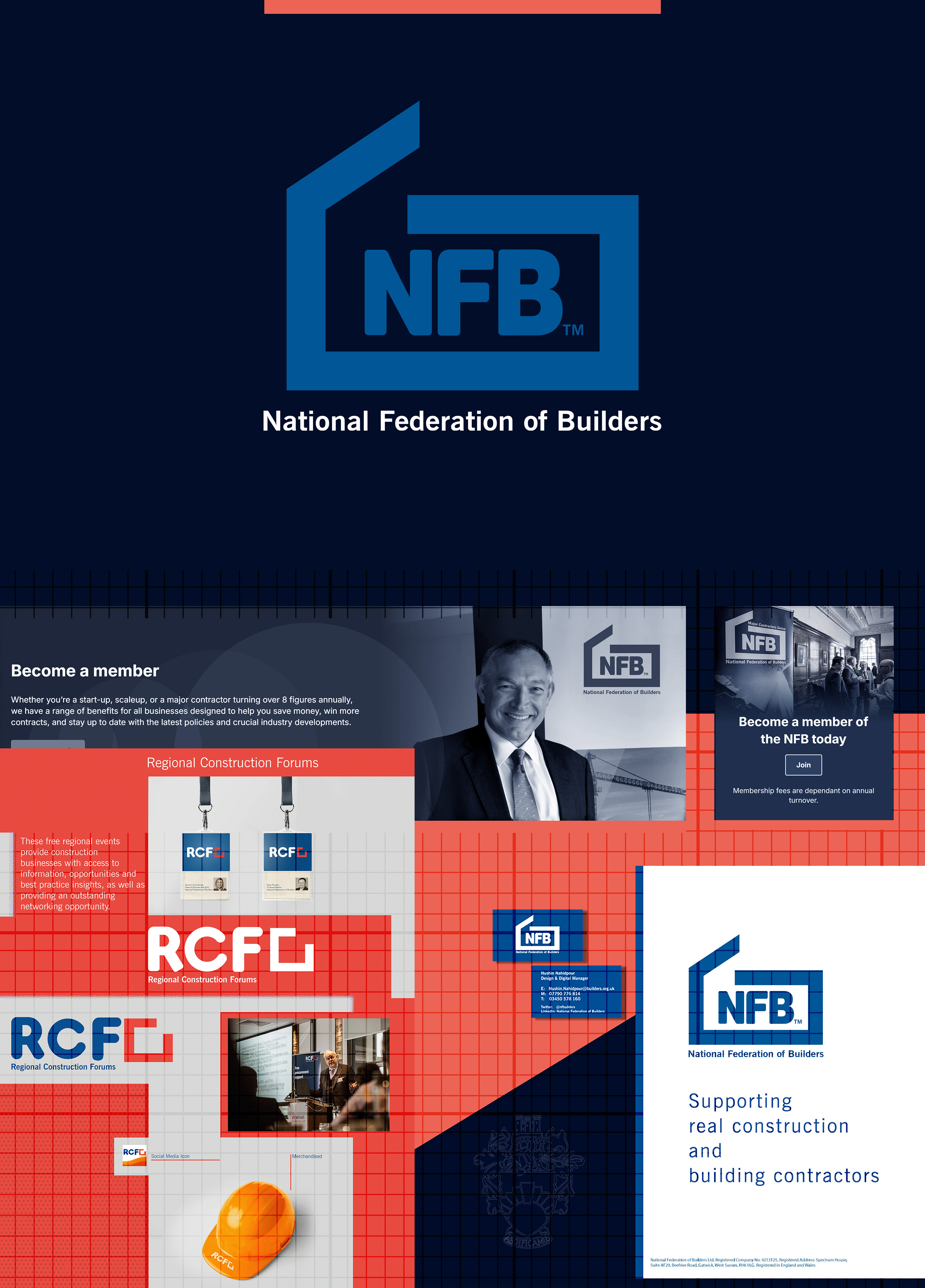
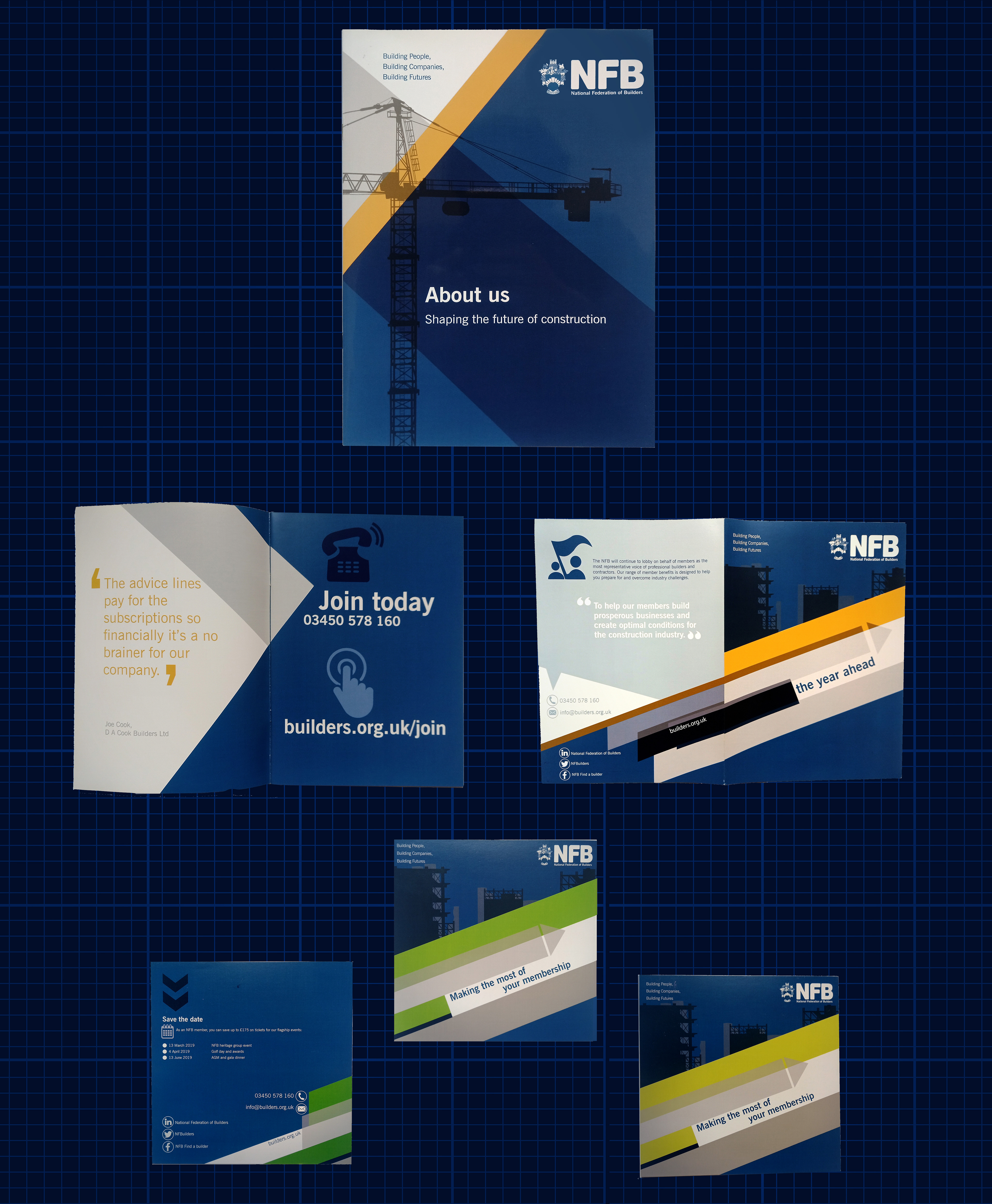
As part of the National Federation of Builders’ rebrand, I developed a more modern, structured and dynamic visual identity. The new logo expresses strength, professionalism and a forward-thinking approach, replacing the previous mark with a cleaner, more contemporary aesthetic. Refined typography and a geometric system convey reliability and innovation, aligning with the organisation’s commitment to growth and industry leadership. Although the rebrand was not fully completed due to internal changes and a shift in organisational priorities and strategy, the continued use of my logo demonstrates the value of the updated direction. Unfortunately, as there wasn’t time to produce comprehensive brand guidelines, the logo hasn’t always been applied consistently or to best effect, and the wider brand has not been developed further since then. Despite tight timelines, the project was a valuable exercise that further developed my skills and contributed to a refreshed visual identity for the organisation.